Therefore sometimes it also makes them grumpy. However showing grace under pressure is what is recommended for the designers. When there are tons of projects to do, only the thought of it is consuming. So in order to get the things done one has to take the feedback and criticism positively. That really helps one to grow mature and grow better.
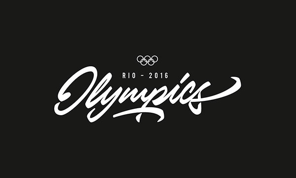
I have been presenting some true design posts for you, here I have put forward a collection of 20+ Stunning Lettering Collection & Logotype by Stephen Bradbury. It is an amazing collection that will give you plethora of ideas that how you can make work with lettering with the amalgamation of logotypes. I personally love this blend, two in one always has more power, more stance and more grandeur to impress. It gives more depth and gravity to the formations. Every logotype is different because of its mixture with lettering. They are looking stunning, vocal, vibrant and classy as well.
Although the only colors being implied are black and white, with a plain background the logotype looks more popping & worth noticing, each one has its own aura. You must try this technique, seek guidelines from these. Few of them are sleeker, other are a bit bolder. It is up to you which one looks better for your project. The artist is very skillful and has full command on his hand. Such artists must be followed wholly for the better outcome of projects. Their experience are ample to teach us.
More : Stephen Bradbury


