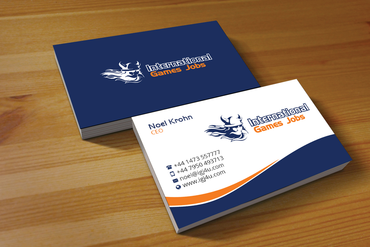
Are you planning to design a business card? Here are 6 tips to create artistic Business Card Design that only professionals follow.
Whether you have just started a new business or you have a quite old and renowned brand, can you think of your company not having a business card? It’s a must for any company regardless of its size. In fact, it’s one of the old yet popular marketing tools that will never lose its potential.
Why do we need a business card? The straight and simple answer is for networking. When we get introduced to a client or investor, they won’t remember our name or the 5-minute meeting. But, your business card will leave a string to that conversation they cannot ignore.
Thus, creating an impactful business card is extremely crucial because an artistically designed card has a lot to express. Here are some secret tips for making an incredible business card.
6 quick tips to design a creative business card that gets everyone’s attention
1. What do you need to include on a standard business card
When you design a business card, make sure you don’t overwhelm the card with too much information. It cannot attain everything about your business.
However, include the main information in a way that the receiving end can understand your business and communicate with you when needed. Here are the basic things you must include in an ideal business card:
- Company logo with the name
- Business slogan or byline
- Your name
- Your designation
- Company address
- Phone number
- Email address
- Web address
2. Choose the right font and color
Catching your audience’s attention is really important with a business card. How can you make your card a striking one? You can use vibrant color however picking up too much bold color can be unprofessional. You need to be really careful about choosing the color.
For instance, you may find black as a gorgeous color and want to use it on your card as it’s unique. However, the information you include on a black background may be difficult to read and lose the shine to grab the attention.
Therefore, choose the background color, font, and font color wisely so that altogether it makes a perfect combination. On top, the text on the card should be highlighted and readable easily.
3. Design the card compatible and appropriate for your company
Designing is certainly a creative job. But, what you are designing and for whom are important factors to consider when you are designing business cards. Depending on the profession and company, the card design varies.
When you are designing a card for doctors, engineers, bankers, and so on, the design must be professional. Nevertheless, if you are designing for a graphic design company or advertising agency, the card needs to showcase a bit of your creativity and skill.
So, creating an appropriate design as per the profession and company is essential. But, remember not to overdesign it because simplicity is preferable to complexity.
4. Design front and back
The traditional business card comes with front design. The thing is, people exchange a lot of cards for business purposes. Do they keep them all? Certainly, no. Even if you haven’t had any business deal with your new client yet, you need to give them a reason to hold onto your card.
One way to do this is to stay unique. If you are a salesperson, you can offer a discount on the back of your card. Or, if you are a doctor, you can add an emergency contact list. Nevertheless, if you are selling kids’ products, you may design the card in playful features, vibrant color and child script font.
Depending on your potential consumer, you need to find the reason that will make them remember you.
5. Choose a simple design, right size, and usual shape
Less is more. It’s a true fact when you want to make a statement with design. The purpose of designing a business card is to highlight the contact information and give an insight into your business. Thus, your card should derive the focus of your client to the information at the same time make your business seem valuable.
With a simple design, color choice and positioning of the information, your card can look simple yet elegant. Nevertheless, a traditional-looking card comes in rectangular shape and information placed horizontal position. It’s not the rule that you cannot break.
Rather, you can play with the positioning. You can make a vertical card with a geometric shape. If you don’t want to take the risk, then you can still make a unique card with font, color, and shape as well with graphic design.
6. Choose the right material for the card to complement the design
You may have an incredible business card design. But, if you don’t print the design on high-quality paper, then it won’t seize the real attribute of the design that you are expecting to capture attention.
Though it’s a matter of your client’s budget, you should still pay attention to the printing material while designing the card. Then choose exquisite elements like card stock, gold leafing, textured paper, emboss and so on. Remember to choose the elements that will complement the design and illustrate the business value. I suggest choosing 2 elements at most!
Final Thought
I hope these 6 quick tips will help you design an elegant business card for your valuable clients. Consider these tips and come up with a creative and outstanding design that will accentuate your client’s business. Do let us know how these tips were helpful to you!

